

"Mobile first" refers to a concept in responsive web design. The mobile-optimized version of the website is developed first, followed gradually by enhancements for larger displays such as desktop browsers. In other words, you work from the smallest layout version to the largest. Web design based on the Mobile First principle is an adaptation to the fact that Internet usage is increasingly shifting towards smartphones. The proportion of search queries from all relevant countries made via smartphones is now significantly higher than those made via traditional desktop devices.
Advantages of Mobile First
Mobile First is a strategic approach with advantages throughout the entire web development process:
-
- Focus on the essentials
- Quick access to information
- Maximum performance on all devices
- Less code
- No more programming effort than necessary
- Design, images and functions adapted for smartphones
This in turn creates several additional advantages, such as:
-
- Mobile optimization is automatically taken into account right from the beginning of the website planning process.
- Only the most important content is included on the page, and only what is essential is displayed.
- A page optimized for mobile devices can later be adapted more easily to new developments due to its leaner structure.
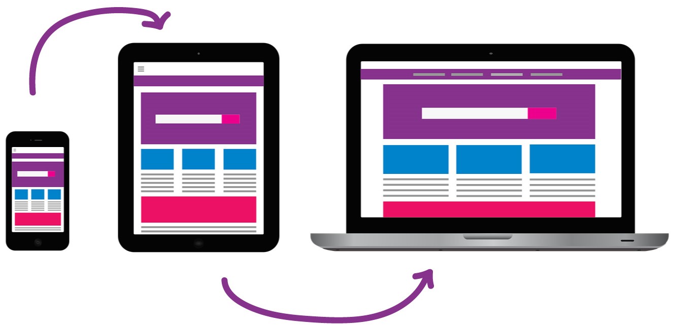
Mobile friendly
Whether a page is mobile friendly can easily be tested using various tools. With the Google Webmaster Tool , the URL of the mobile or responsive page can be entered. The tool then analyzes how the Google crawler accesses the website, whether all important factors are taken into account, and whether the website is recognized as mobile friendly. In addition to the Google Webmaster Tool , website check tools can also be used to test a website's mobile optimization. The IONOS Website Checker also provides additional relevant information about the visibility of the tested website on the web. Another free tool is the one from Experte.de. What makes this tool special is that it allows a large number of URLs to be tested automatically. This makes it less tedious to check an entire website for mobile friendliness.
A page is mobile friendly if:
-
- The content can be understood as quickly as possible
- The content is responsive and therefore immediately readable
- The website has short loading times
- Links are easy to read and can be clicked without difficulty
A page is not mobile friendly if:
-
- Software that is uncommon for mobile devices is used (e.g. Flash)
- The font is too small and difficult to read
- The links are too close together
- The content is too wide for the display

Do you have any further questions about this topic? Or do you need help designing your website from a professional web agency in Munich? Then feel free to contact us!