

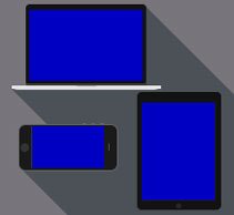
Responsive websites are based on flexible design grids and automatically adapt to the different screen sizes of various devices. For optimal display on tablets or smartphones, so-called breakpoints are defined using CSS media queries. These are the points at which the design of a website changes or the containers wrap.
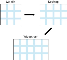
For example, it is possible to change a two-column layout into a four-column layout from a certain width. Breakpoints can be defined based on standard device widths, a grid, or the content. There are many ways to determine breakpoints sensibly. The goal is always to present the appearance as consistently as possible across all devices. The website should also be intuitive and easy to use.
Examples of common media queries:
The min-width property is used to define the minimum width of an element. This prevents the used value of the width property from becoming smaller than the value specified by min-width. The max-width property is used to define the maximum width of an element. This prevents the used value of the width property from becoming larger than the value specified by max-width.
Smartphones
@media only screen and (max-width: 640px) {
CSS declarations for the screen size mentioned above go here.
}
Tablets
@media only screen and (max-width: 768px) {
CSS declarations for the screen size mentioned above go here.
}
Larger than tablets (laptops and desktops)
@media only screen and (min-width: 992px){
CSS declarations for the screen size mentioned above go here.
}
Mobile First – what is it?
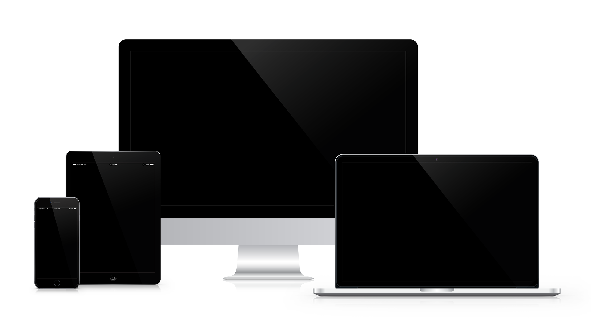
“Mobile First” refers to an approach to designing a website. The mobile version is developed first and then adapted to larger devices. Code for larger screens is usually much longer and more complex than code for smaller screens. To keep the code as small and simple as possible, the Mobile First approach is used.
The basic structure of the CSS file looks like this:
At the beginning of the file, there is only the CSS code for smartphones
@media only screen and (min-width: 500px) {
Additional code for devices wider than 500px goes here (e.g. smartphones in landscape mode, small tablets)
}
@media only screen and (min-width: 768px) {
Additional code for devices wider than 768px goes here.
}
Do you have any further questions about this topic? Or do you need help designing your website from a professional web agency in Munich? Then feel free to contact us!