


The difference between sans-serif fonts and serif fonts lies in the so-called serifs, which are decorative elements on letters. These are the small finishing strokes at the top or bottom of letters. Sans-serif fonts have clean lines and no decorative elements.
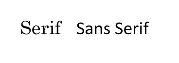
Examples of serif fonts:
- Times New Roman
- Baskerville
- Palatino
- Garamond
- Sabon
Examples of sans-serif fonts:
- Avenir
- Helvetica
- Gotham
- Futura
- Neuzeit
Which fonts should be used for websites?
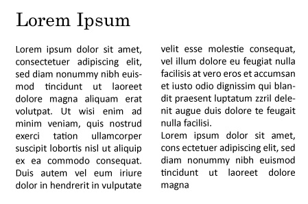
Generally speaking, serif fonts are suitable for printed texts, while sans-serif fonts are recommended for text displayed and read on screens because they are easier to read. The font should also match the overall design of the website. This is especially important when combining different fonts, as they should work harmoniously together. Since screens have limited resolution, letters with serifs can “blur” at lower resolutions, appearing pixelated and making the font look less sharp. This is particularly noticeable at smaller font sizes. Therefore, sans-serif fonts are recommended for longer texts displayed on screens. The two font styles are often combined. Serif fonts are frequently used as headings or subheadings on many websites, while sans-serif fonts are chosen for longer texts to maintain readability.
What impression do serif fonts create?
Fonts with serifs often appear elegant, lively and traditional. Fonts with sharply angled serifs (classic Roman typefaces) appear stricter and clearer than fonts with softer, flowing serifs. They also convey a sense of tradition, respect, reliability, security and professionalism. This is why serif fonts are often used by law firms and in the fashion and hotel industries. These industries take advantage of the effect of these fonts because people in these fields place particular value on tradition, security and professionalism.
What impression do sans-serif fonts create?
Sans-serif fonts often appear very modern, timeless, stable, calm and objective. Many young and forward-looking companies use sans-serif fonts because they are ideally suited to innovative industries. The reason is that these companies want to appear friendly and approachable, which is something sans-serif fonts can convey. Another advantage, especially online, is their good readability. They can also convey a sense of calm and objectivity.
Do you have any further questions about this topic? Our web agency will be happy to assist you!