

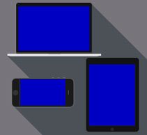
Bootstrap is a free frontend CSS framework. It contains CSS- and HTML-based templates for designing buttons, grid systems, icons, typography and highlights, tables, forms, navigation and other design elements. Bootstrap is also a responsive framework developed with mobile devices such as smartphones in mind first (“Mobile First”). This means that Bootstrap uses media queries to adapt applications and websites to virtually any device without requiring duplicate code.

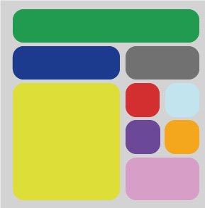
Another important component is the Bootstrap grid layout. This grid system divides layouts into 12 columns. This makes it easier for users to precisely define the spacing and positioning of individual elements on a website. When arranging elements within the layout grid, different screen sizes can be taken into account.
Why use Bootstrap?
Since Bootstrap scales websites in a particularly simple and efficient way, it is well suited for implementing responsive designs. There is a large selection of pre-built components and themes that can be used directly. The system is also logically structured, easy to implement and can be extended with JavaScript and jQuery plugins. It saves a significant amount of time through its pre-built components. In addition, it offers excellent compatibility with both older and newer browsers. Furthermore, the maintenance effort is lower compared to using several different frameworks.
Advantages
- simplifies frontend web development through standardized layout specifications
- developed based on HTML5 and CSS3, with a focus on backward compatibility with older browser versions
Disadvantages
- the complete framework is very extensive and can increase loading times
- the layout has to adapt to the framework.
Do you have any further questions about this topic? Or do you need help designing your website from a professional web agency in Munich? Then feel free to contact us!