

“Readability” – often also referred to as “legibility” – is understood in the field of reading typography as the optimal macrotypographic and microtypographic presentation of a body of text, which a recipient (reader) perceives as pleasant, correct, and non-disruptive even when reading longer passages of text, for example in a book, newspaper, annual report, or on a website.
In addition to sentence structure, language style, text structure, text difficulty, language and reading skills, reading distance, reading and viewing habits, as well as psychological and physical conditions, the skillful typographic presentation of a body of text is essential for reading motivation, reading speed, comprehension, and the expressive possibilities of a language in its written form (see also typeface mixing).
The visual or typographic design of a text is always perceived before its content. Typography therefore influences the recipient even before the actual reading of a written language, determining whether and how they decode the text or whether they are more or less reluctant to engage with it – for example, due to an unpleasant gray value.
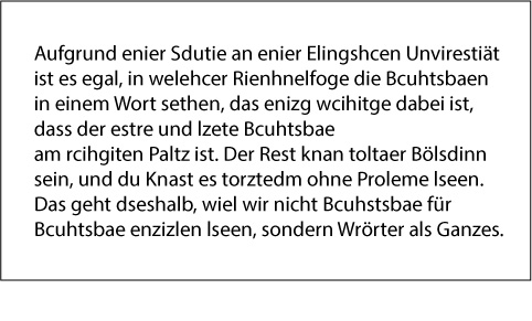
Although this example is essentially a nonsensical text, a reader with average reading skills is able to recognize the word shapes as familiar patterns and interpret them accordingly. This leads to the conclusion that we do not read individual letters but rather words. The higher the reading ability, the greater the recognition of word patterns.
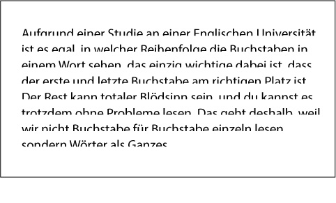
Despite the text containing errors, the word shapes can already be recognized as familiar patterns by their upper x-heights and ascenders and interpreted accordingly. Serifs provide additional reference points for rapid decoding as part of a pattern-recognition process. This is why serif typefaces can generally be read faster than sans-serif typefaces.
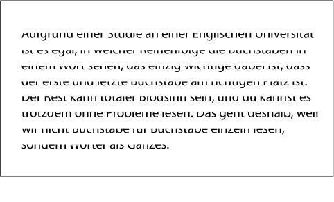
Even for a reader with a high level of reading ability, it is likely to be difficult to recognize the word shapes by their lower x-heights and descenders as familiar patterns or even to interpret them meaningfully. This leads to the conclusion that we read along the upper edge of a line of type and that the shapes of the upper x-heights and ascenders are more important than those of the descenders of a letter.
Reading styles for book typography

Reading is an interaction between the perception of form and verbalization. The task of applied typography is to optimize this perception of form so that words can be decoded effortlessly and smooth reading is possible. To achieve this, typographic design must always take a back seat to the content, to the extent that it is no longer consciously perceived while reading.
Six different reading styles can be distinguished in book typography:
-
Linear reading = the classic way of reading, in which one thing is read after another
-
Target group: voluntary readers
-
Motivation: curiosity, enjoyment, voluntary reading
-
Example: novels, stories
-
Design principle: do not distract; ensure good readability without visual disturbances
-
-
Differentiated typography
-
Target group: professional readers (e.g. scientists, students…)
-
Motivation: reading for professional purposes
-
Example: textbooks, non-fiction books, academic books
-
Design principle: as unambiguous as possible
-
-
Informative reading
-
Target group: readers interested in obtaining information quickly and who do not want to read books
-
Motivation: gaining an overview of a subject area – the text is initially skimmed/read diagonally
-
Example: newspapers
-
Design principle: as clear and well-structured as possible
-
-
Consultative reading
-
Motivation: targeted acquisition of larger units of information
-
Examples: reference works of all kinds, such as encyclopedias, dictionaries, timetables, etc.
-
Design principle: as clear as necessary
-
-
Selective reading
-
Motivation: targeted acquisition of smaller units of information
-
Examples: formula collections, songbooks, cookbooks
-
Design principle: as clear as possible
-
-
Activating typography = typographic design intended to encourage people to read
-
Target group: “unmotivated” readers
-
Motivation: undifferentiated reading, no explicit motivation
-
Example: magazines, advertising
-
Design principle: arouse curiosity and spark interest
-
Conclusion
The primary task of reading typography is to design the perception of form in such a way that the content can be effortlessly understood by the reader. Typography should recede behind the text to such an extent that it is not explicitly perceived; when the “reader does not notice that they are reading.”
Do you have any questions about this topic? Or do you need help designing your website from a professional web agency in Munich? Then feel free to contact us!