

In our web design agency, it is particularly important to us when creating websites that users can find the information they need as quickly and efficiently as possible when visiting a page. The first step a user takes when arriving on a new website is often to briefly register the structure of the website and skim the first texts. It is therefore important to guide the user from this very first step and make their search for information as easy as possible.
This can already be achieved through the basic layout of the website. If it is clearly structured and easy to understand, there is a greater chance that users will discover something interesting and therefore stay on the page longer.
An important aspect that is essential when creating any layout is determining the content width. Should you actually use the full width of the screen, or should there be margins on the left and right, and how large should they be?
Basically, there is unfortunately no perfect content width, as every website is unique and therefore has its own requirements. Depending on the purpose of a website, the requirements for the design and therefore the layout also change.
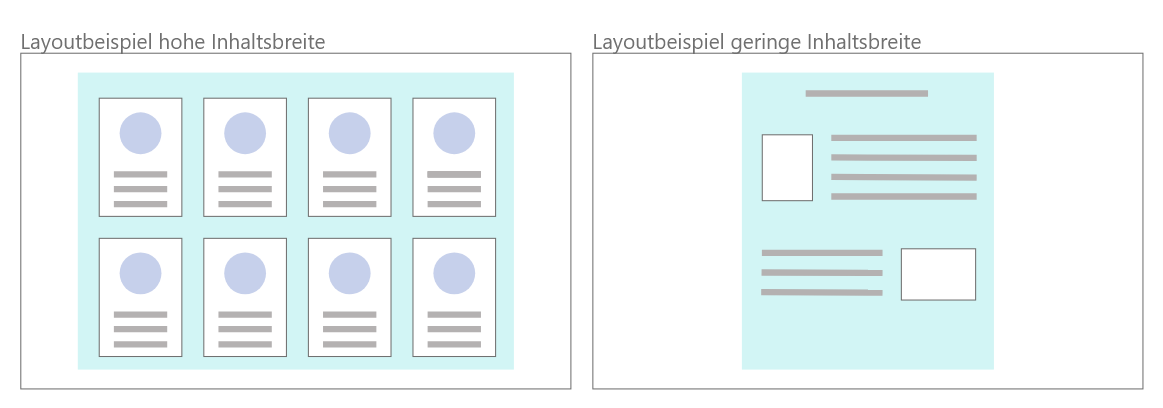
Using the full width can quickly make a website appear overloaded if it consists mainly of text. An online shop, for example, wants to be able to display as many products as possible on a single page. In this case, it therefore makes sense to use the entire width so that users can see more products at a glance.
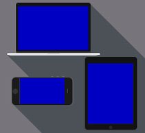
Furthermore, websites should nowadays also look good and be user-friendly on different devices (computer, tablet, smartphone). In other words, they should be responsive. It is therefore not sufficient to define the content width once for a computer, as otherwise users would have to scroll horizontally in the tablet or smartphone view to read the entire content if it does not fit completely on the screen.
An important indicator for determining a suitable content width is the user's reading flow. This should of course be as smooth and pleasant as possible. Since a large portion of website content usually consists of text, this should definitely be taken into consideration:
A line length of 70 to 90 characters is often recommended for websites. This corresponds to approximately 10 to 12 German words per line. For tablets, a line length of 50 to 75 characters per line is recommended, while smartphones should aim for around 30 to 40 characters.
These character limits are intended to ensure a smooth reading flow for the user. This means that readers can quickly skim a text and easily move to the next line without losing their place. With a shorter reading width, the reader also does not have to move their head to take in the entire content. Because the reader can read the entire text simply by moving their eyes, they can read considerably faster, which makes skimming texts much easier for the user.
However, the character counts are only intended as a guideline and should by no means be considered absolute. As mentioned above, every website has individual requirements and therefore needs an individual layout.
If you would like to learn more about web design and user experience design, feel free to read more articles from our web agency, such as "What Makes Good Design?" or "What Should Be Considered When Choosing Colors for a Website?".
Would you like to create a website or an online shop? Then contact us now!