


Whether you are choosing colors for the overall concept of a website or simply designing individual elements, the selection of these colors should be carefully considered. Depending on which colors are combined, very different effects can be achieved. Therefore, it makes sense to first understand the basics of color theory.
RGB Color Space for Web Design
The RGB color space is used in web design, which is why the following content will focus on this model. In this color model, the color of a pixel is composed of the primary colors red, green, and blue. Each of these three basic colors can have a value between 0 and 255. Depending on the mixing ratio, a specific color is produced. If all three primary colors are set to 0, the resulting color is black. If red, green, and blue each have a value of 255, the result is white. Based on this principle, theoretically around 16.7 million different color shades can be mixed.
The Color Wheel and Primary, Secondary, and Tertiary Colors
A color wheel can represent different colors in relation to one another and therefore helps to understand how they can be combined.
Primary Colors
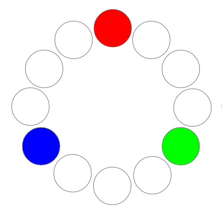
Depending on the color theory being applied, color wheels can look very different. As already explained, the RGB color space is used in web design. According to this color theory, red, green, and blue are therefore considered the primary colors.
Secondary Colors
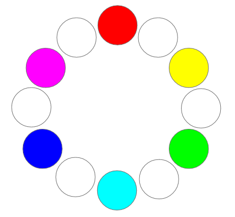
Secondary colors are created by mixing two primary colors. In the RGB color space, mixing red and green produces yellow. Combining red and blue results in violet, while blue and green produce turquoise.
Tertiary Colors
A tertiary color is created by mixing a primary color with a secondary color. This produces additional colors such as blue-green, blue-violet, or orange.

When primary, secondary, and tertiary colors are combined, they result in 12 basic colors that can be used as the foundation for a website's color scheme. By creating variations of these 12 basic colors and changing parameters such as saturation, brightness, and transparency, a wide variety of colors can be mixed.
Color Schemes
There are various color schemes that can be used to create a color concept for a website. A color scheme can help you choose colors that work well together.
Monochromatic Color Scheme
With a monochromatic color scheme, one color is selected. All other shades are created by lightening or darkening this color. This makes the overall color concept appear very cohesive, but there is also a risk that it may seem boring and monotonous. It is especially important here to ensure that the different shades have sufficient contrast to guarantee readability and a clear structure on the website.
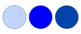
With this color scheme, it can be useful to incorporate white, black, and shades of gray to make the design more varied and interesting.
Analogous Color Scheme
An analogous color scheme is made up of colors that are next to each other on the color wheel. No more than three adjacent colors should generally be selected. The less contrast there is between the individual colors, the more harmonious the color scheme appears. However, sufficient contrast should also be maintained so that the colors can be clearly distinguished from one another.
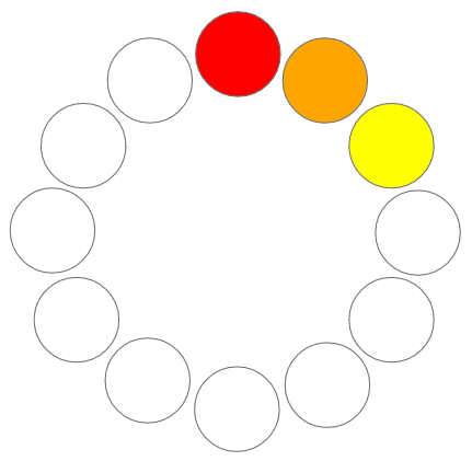
For the color concept, it is advisable to choose one dominant color that is used for larger areas. The other colors can serve as accent colors and highlight specific elements. A primary or secondary color is often chosen as the dominant color.
An analogous color scheme can easily create either a warm or cool look because the colors are located close together on the color wheel. Yellow, orange, and red, for example, create a warm impression, whereas green, turquoise, and blue tend to appear cool.
Triadic Color Scheme
A triadic color scheme consists of three colors that are equally spaced from one another on the color wheel.
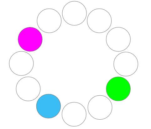
A color concept based on this scheme often appears colorful and lively, even when relatively pale shades are chosen. Here too, one dominant color should be selected, while the other colors should be used only as accents. Otherwise, the design can quickly become visually busy and overwhelming. A triadic color scheme often appears less formal, but more lively and cheerful.
Contrasts
To combine the selected colors effectively, it is useful to apply different types of contrast. This makes it possible to clearly communicate the hierarchy of the user interface within the website layout and deliberately direct the user's attention to specific elements.
Hue Contrast
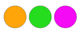
Individual colors can already create contrast with one another. This is particularly noticeable with vivid colors that have a high level of saturation. The degree of colorfulness of two colors can therefore be used to create a contrasting effect.
Complementary Contrast
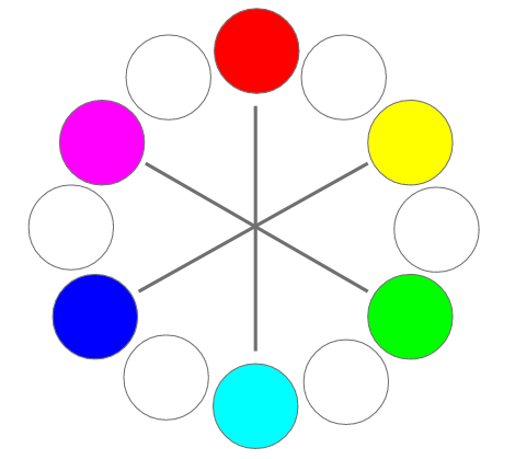
A complementary contrast is created by two colors that are directly opposite each other on the color wheel. Red and green or yellow and blue are examples of complementary colors. When placed next to each other, they create a strong contrast.
Light-Dark Contrast
Light-dark contrast is less a color contrast and more a contrast in brightness. This type of contrast combines a particularly light color with a very dark color. The strongest contrast is created by black and white. However, other colors can of course also be combined to create a strong contrast.

Warm-Cool Contrast
Warm-cool contrast is highly subjective. Every person perceives it to a different degree. This type of contrast combines a warm color with a cool one. Examples include combinations of green and orange or blue and yellow.

With this knowledge in mind, you can deliberately direct a user's attention and create a specific mood when developing a color concept for a website or online shop. You can learn more about this in another article from our internet agency: "The Effect and Function of Colors".
If you would like to learn more about UX design, feel free to explore the other blog articles from our web design agency: "What is UX Design?", "What Makes Good Design?", and "How Does a UX Designer Work?"
More information about design can be found on our Design page, in our agency presentation, or contact us directly.