


Contact forms are an important component of a website and a major part of active customer-website interaction. The form often determines whether a customer likes a website or not. There are different ways in which a form can be arranged on a website.
Most commonly, it is displayed at the end of a page (“Footer Form”, see Fig. 1), in a box format at the top (“Lightbox Style”, see Fig. 2), or as a separate page containing the contact information (see Fig. 3).
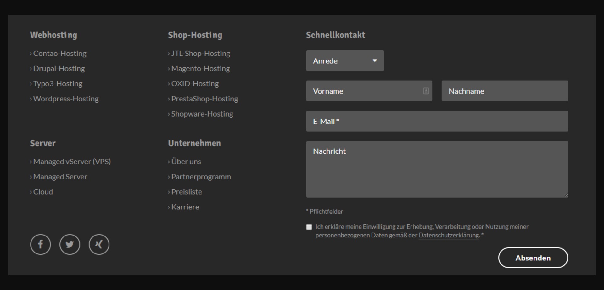
Each of these approaches has different advantages and disadvantages. The “Footer Form” should only be used if you have a blog and readers may have questions after reading the blog posts that can be answered through the contact form.
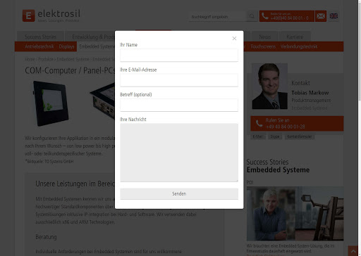
The “Lightbox Style”, on the other hand, should be used when the page is very long or when it is important for users to be able to contact the website owner. However, it must be ensured that the entire form is visible at first glance without scrolling.
The last commonly chosen way of arranging the contact form on a website is to simply create it as a separate page under “Contact”. This approach is very clear and the user is not distracted, which results in a higher completion rate.
Since most people do not particularly enjoy filling out forms, it is important to make the user experience as pleasant as possible. The goal of a user-friendly form is to give users as few reasons as possible to abandon the form before completing it.
External Appearance of the Contact Form:
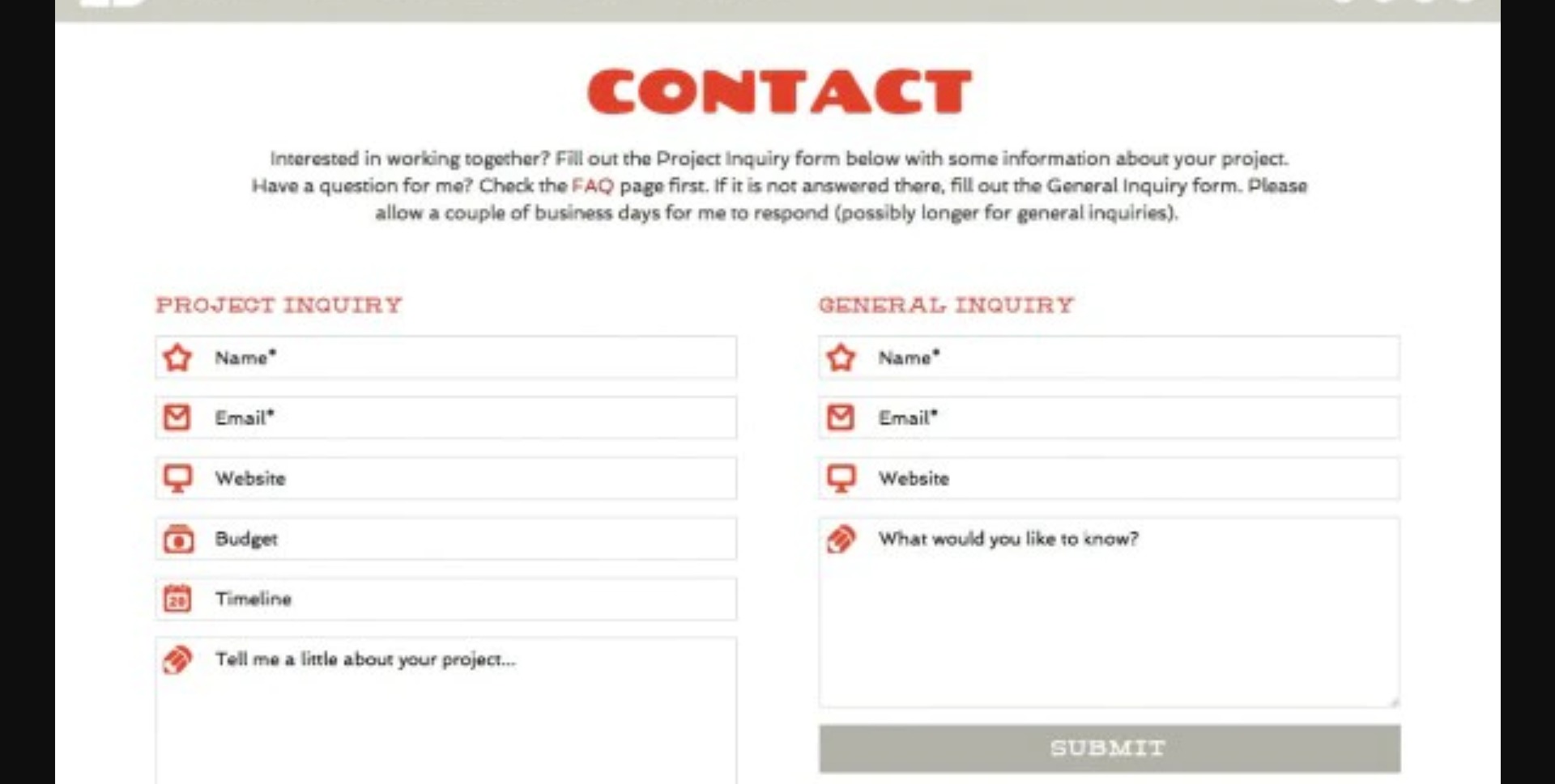
To make designing the form easier, you can follow a few rules to make the design more appealing.
First, you need to make sure that the contact field is clearly recognizable as such and cannot be overlooked. This can be achieved either through a clear heading or through a distinctive layout (e.g. Lightbox Style).
In general, you should limit the form to the most important fields so that users do not feel that filling out the form will take forever. The fewer fields a form has, the easier it is to keep the form clear and organized.
Providing additional information (telephone number, address, email address, etc.) makes the website appear more credible to users and gives them the opportunity to contact the website owner in other ways.
Ideally, required fields should be marked, as this can save customers time and help them focus on the most important fields. The * symbol is frequently used to indicate required fields.
If the form to be created contains many required fields, the form should be divided across several pages. The sections should be organized into different topic blocks (e.g. address, personal information, etc.).
To keep users informed of their current progress, a progress indicator is recommended for multi-page forms. This allows users to see how much time the form will still require. In addition, multi-page forms should have automatic intermediate saving so that the data already entered cannot be lost when clicking the “Next” and “Back” buttons.
Last but not least, it is recommended to always place the “Call-to-Action” button (in this case the “Next” or “Submit” button) within the visible area. This allows users to better estimate the length of the form.
Error Messages:
Error messages are a very important part of a form because they provide customers with feedback about their entries.
They appear near one of the incorrectly completed required fields (e.g. “Username is already taken”, “Password is too short”, etc.). The wording should always be polite, friendly, and specific so that users know how to improve their entries (e.g. “your password must contain at least one number and one special character” instead of “your password is too weak”).
Users can also be provided with additional assistance by displaying computer-generated alternative suggestions (e.g. “Unfortunately, this username is already taken. Try xyz instead” rather than “Unfortunately, this username is already taken. Please try again”).
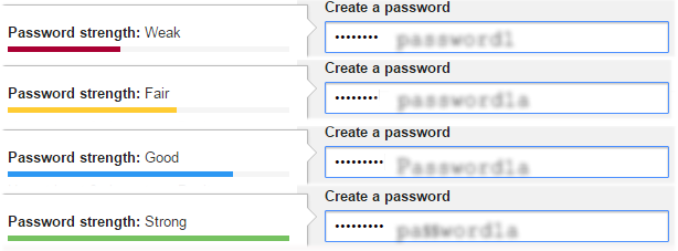
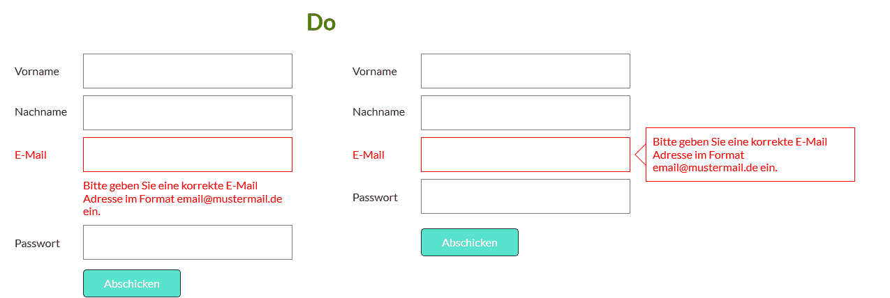
To make error messages as appealing as possible, speech bubbles are often used to display the messages (see Fig. 4). It is also important to visually emphasize the error message. This is often done using red/bold text or appropriate icons (crosses and exclamation marks for color-blind users) next to the incorrectly completed field.
Positive feedback also has an impact on users. Icons such as green checkmarks next to valid fields can provide customers with feedback about their entries. The message should be placed close to the field it refers to.
There are three different types of validation:
First, inline validation: the error message appears immediately after leaving the field, which can prevent the page from being reloaded and all entered user information from being lost.
Inline validation also provides good feedback for the user. With tools such as the “Password Strength Meter”, users can independently edit and improve their data. Inline validation is an important tool for reducing the error rate, allowing forms to be completed more quickly, and increasing customer satisfaction. It is important to keep the messages visible so that users can check once again before submitting the form that they have not forgotten anything.
It makes sense to use inline validation for fields such as “Username” and “Password”. However, it can potentially cause problems with fields such as “First Name” and “Last Name”. If a user has an unusual name or uses foreign characters in their name, it could incorrectly be flagged as invalid.
Second, client-side validation: checks the data entered by the customer before it is sent to the server.
However, it only works if the user has JavaScript enabled. If a required field is left empty or contains invalid characters, an error message will appear. This validation can be used to reduce the errors detected by server-side validation. Since client-side validation can also be bypassed/manipulated, server-side validation is additionally required.
Third, server-side validation: server-side validation is used because client-side validation is usually not completely reliable.
Server-side validation filters out all harmful data. If client-side validation has been bypassed, server-side validation can protect server-side processing from potential damage.
Spam Bots:
A spam bot is a largely autonomous computer program that sends unwanted electronic messages. These can also cause problems with contact forms because they enter data into the fields and send spam messages. However, there are different ways to eliminate these spam bots:
“CAPTCHA Services”: the user must either enter a security code (see Fig. 6) or answer a security question (see Fig. 7) before sending the message. These tasks should be easy for humans to solve. If the field is left blank or the answer is incorrect, the message cannot be sent. Spam bots cannot read the code or question and therefore cannot send a message.
 Figure 6: CAPTCHA Service (Security Code)
  Figure 7: CAPTCHA Service (Security Question)
 Time restriction: since spam bots can fill out and submit a form within milliseconds, a time restriction can be configured so that a form must be completed for at least x seconds before it can be submitted. Messages submitted in less than x seconds are most likely from spam bots and are automatically blocked.
Do not allow links: spam bots often attempt to transmit viruses through unsafe links, so it can be configured that the message field may contain no links or no more than x links.
“Honeypot”: a honeypot is a hidden input field. The description should be something like “Leave this blank” or similar so that people accessing the page with a screen reader are not blocked. Spam bots generally fill out all fields automatically, so an error message appears as soon as the field is filled in.
Click check: since a spam bot is a program rather than a human, it does not manually click the submit button with a mouse. With a click check, the browser checks whether the “Submit” button was clicked automatically or hovered over and clicked with the mouse. Hovering over the button is considered a human action, making the message submission valid.
Blacklist: here, all words, numbers, and characters that are not allowed can be entered. As soon as one of the selected words, numbers, or characters is used, the message is blocked.
If you would like to read more about UX design, feel free to take a look at the other blog articles from our web design agency: "What is UX Design?" , "What Makes Good Design?" and "How Does a UX Designer Work?"
More information about design can be found on our Design Page, in our Agency Presentation, or contact us directly.