


A Call-to-Action (CTA), which translates to “prompt to take an action,” is, as the name suggests, a request for the user to do something. In web design, Call-to-Actions are usually interactive elements on a website. They can appear, for example, as a button or a simple link. However, an embedded video can also be a Call-to-Action because it encourages the user to click on it and watch it.
A CTA therefore always pursues a specific goal that requires user interaction. Potential goals of a Call-to-Action can include:
- Purchasing a product
- Signing up for a newsletter
- Accessing informational material (e.g. video, additional text, etc.)
- Downloading a file
- Registering on a website
- Scheduling a customer appointment
Purpose of a Call-to-Action:
As already described above, a CTA always pursues a specific goal. Achieving this goal requires the user to interact with the Call-to-Action.
At the same time, it also serves as a form of orientation and guidance for the user. Since CTAs are usually visually highlighted to attract attention, users can immediately see where they need to click, for example, to purchase a product.
Furthermore, a website can appear clearer and be made more user-friendly when certain additional information is initially hidden behind Call-to-Actions. For example, a user can click on a link to read more about a topic. At the same time, other users who are not interested in the text do not have to scroll endlessly to reach other content on the website.
How is a Call-to-Action structured?
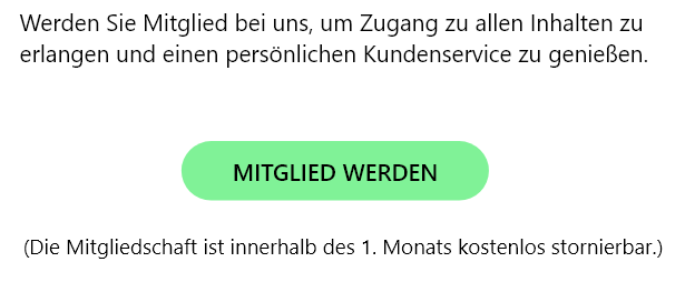
In principle, a Call-to-Action often consists of a lead-in, the element itself (e.g. a button), and a lead-out.
The lead-in is a kind of introduction or transition to the CTA that briefly explains the purpose of the following element. This may be followed by a button, with additional information about the action triggered by the button sometimes displayed underneath. This information is intended to create trust and persuade uncertain users to follow the call to action. It could look something like this:
Designing a Call-to-Action:
When designing a CTA, it is essential to consider the goal being pursued and the target audience it is intended for. The implementation of the following points should be based on these findings.
Content
The wording and tone of the text depend entirely on the type of Call-to-Action and the target audience it is intended to address.
In general, however, a CTA should always be concise, precise, and positive. This means that users should be able to understand the message at a glance and feel directly addressed. However, they should not feel pressured or patronized, but rather perceive the call to action as an offer and an opportunity.
There are different approaches to formulating a Call-to-Action. One option is to address the user directly with phrases such as “Discover your … now” or “Take a look at our new products now!” This makes the user feel personally addressed. However, there is also a risk that the user may feel patronized and therefore choose not to follow the call to action.
Another option is to formulate the imperative from the user's perspective: (I want to …) “... schedule a free trial appointment now,” “... save 20% when purchasing the product now,” and so on.
The advantage here is that the wording resembles the user's own thoughts and that an appealing message can positively influence the user's inner monologue.
Depending on the goal of the CTA, a different approach to wording should be used. To get a feeling for how a Call-to-Action might sound, it is often helpful to first look at common phrases. These frequently include:
- Buy now
- Learn more
- Try for free for 30 days
- Add to cart
- Register now
- Find your ...
- Discover ...
- Experience ...
- Get started with ...
Appearance
In general, the goal is to attract visual attention because a Call-to-Action should always be recognizable as such and immediately catch the user's eye.
With a button, for example, this can be achieved through its color, shape, and size. The rest of the website's design should be taken into consideration so that the overall appearance remains harmonious. Nevertheless, the CTA's color should clearly stand out from the rest of the content, as the call to action may otherwise fail to attract sufficient attention and could be ignored by the user.
Sometimes it can be useful to place a CTA on an image to increase its effectiveness.

However, a Call-to-Action should not be pushed too aggressively into the foreground either, as users may otherwise feel pressured by it and become less willing to follow the call to action.
Placement
There are various ways to place a Call-to-Action. However, it is always important that it is clearly visible and easy to find.
Depending on the type of Call-to-Action, a different placement may be appropriate. For a “Buy now” button, for example, it makes sense to place it below the product so that the user is informed about what they are purchasing and their hopefully positive impression of the product can be used to encourage the purchase.
For “Discover more” or similar CTAs, the CTA can also be placed at the top (“above the fold”), for example on a slider with various images designed to spark the user's curiosity.
A “Read more” button should of course be placed directly below the beginning of the text so that the user can seamlessly display the complete content.
In principle, a Call-to-Action does not necessarily have to be placed on a website. It can also be incorporated into videos, social media posts, emails, or even meta descriptions.
If you would like to learn more about how to draw attention to a Call-to-Action, take a look at the blog article "What Should Be Considered When Choosing Colors for a Website?" from our internet agency. There you can learn how to combine colors effectively and, for example, increase the effectiveness of a website element.
If you would like to learn more about UX Design, feel free to take a look at the other blog articles from our Web Design Agency: "What is UX Design?", "What Makes Good Design?", and "How Does a UX Designer Work?"
More information about design can be found on our Design page, in our agency presentation, or contact us directly.